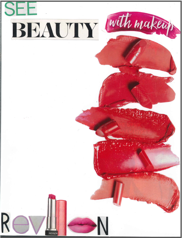
This project was our first of the year, and what we based our other projects off of. We weren't allowed to use any technology, except for scissors, glue, and markers which I thought was weird, considering this was a "Computer Design/ Graphics" class. After starting on this, I realized that we would use our basic skills and tools (again, the scissors, glue, paper, markers etc.), as we progress to more complex tools on the computers. In this assignment, I learned how to create a unique advertisement using emphasis, balance, movement, color, line, etc. By looking through beauty magazines, I decided to make an advertisement based on beauty with makeup. I found a lot of colorful and interesting lipstick designs and images, and wanted to base my ad around the image. These colors, patterns, and designs worked really well together and all of the different features made the individual assets pop of the page (especially the lipstick samples on the far right). I liked the idea of "seeing beauty with makeup" because makeup helps you express yourself, and I think it's important that everyone recognizes that. The main element that I focused on was color, which is evident in the lipstick samples on the right side of the ad. The bright pink and red lipstick, the green lettering for "see" and the "Revlon" lettering all clearly illustrate color. The main principle that I focused on was emphasis, shown on the right side, and in the wording. by putting the "with makeup" cut out on top of the lipstick image, to create a sense of line. I also incorporated a lipstick tube as the "l' in Revlon," and lips as the "o" to create a cool substitution that pertained to the brand I'm advertising.
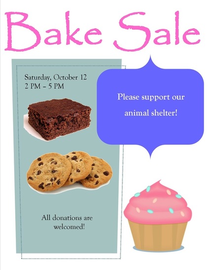
Using the template option for my flyer, I created an advertisement for a bake sale. At first, there were a few different text boxes and inserts, with different colors, shapes, positions, etc. Although this was the template flyer, I still wanted to make it my own. So, in Microsoft Publisher, I changed the colors, positions, borders, fonts, etc. I also added a few images of bake sale items, such as brownies, cookies, and cupcakes, but I still kept it simple. Since this was a bake sale flyer, I wanted to make it easy, quick, and simple to read and to perceive the message. Then I focused on color and balance to draw attention to the major details. The bright colors of the lettering, text boxes, and clip art move your eye around the page. The soft, pastel colors make it almost simple but sweet, and easy to read.
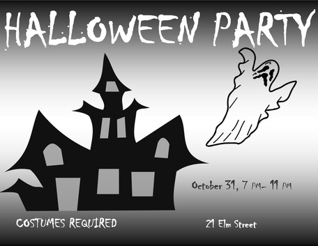
Using the black and white template, I converted my "no template" flyer into black and white. The Halloween party template used emphasis, contrast, and balance in the text and clip art to draw attention to the paper. The dark and light colors created a large contrast between the accents. Since this template was the same as the color one, I had to adjust the black and white and the brightness, to make it different. I used the "chiller" text to make it spooky, as well as a haunted house image, and a ghost to make it look like Halloween.
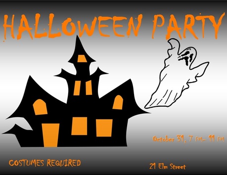
Using the "no template" flyer, I advertised a Halloween party. I used color, emphasis, and balance to draw your eye across the flyer. By using bright orange accents, I was able to make the colorful words and images pop off of the page. I used orange and black, to make it look like a Halloween flyer, as well as a haunted house image and a ghost. I matched the text with the orange windows from the haunted house, just to have the whole flyer flow and to make it easier to see.
|
|
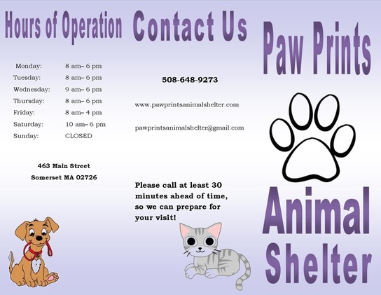
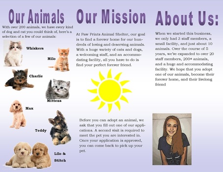
For the brochure project, I created a brochure for a an animal shelter. "Paw Prints Animal Shelter" was hypothetically an animal shelter located in Somerset MA, with any cats and dogs. I was the owner of the shelter, and was advertising the business, looking for people to adopt one of our animals. By using bright colors and lots of images, I made the brochure very aesthetically pleasing, making people want to read about our business. I also used balance and emphasis, by making certain text bold, to emphasize the more important details.
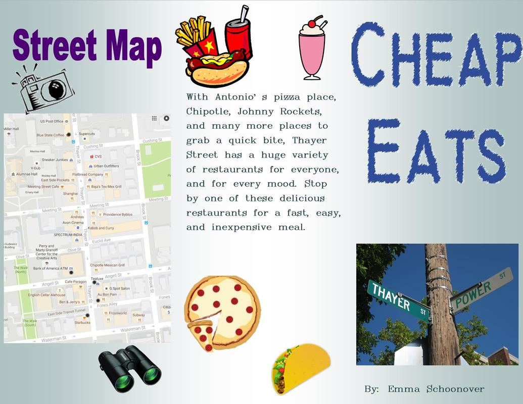
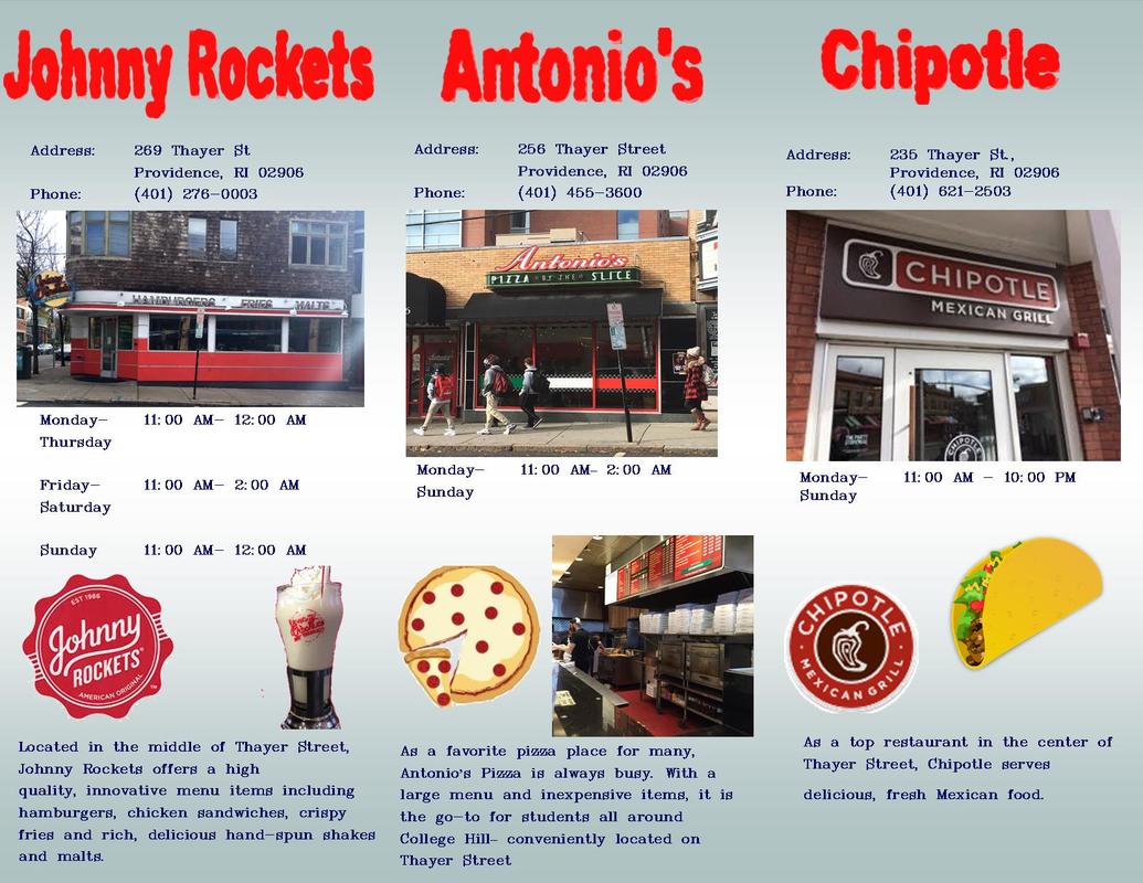
For my Thayer Street brochure, I thought that a lot of visuals would really capture people's eyes. So, I used a lot of clip art, along with pictures I took, of food, street signs, logos, and maps. I also used a lot of different text, colors,fonts, etc., so nothing got to repetitive. Since my category was "Cheap Eats," I went to many fast food restaurants, such as Johnny Rockets, Antonio's, and Chipotle. Johnny Rockets is a fast food restaurant, where you can get burgers, fries, shakes, etc. It was created to be an "American fast food restaurant," which is reflected in many of the menu options. Antonio's is a really good pizza place, that has every flavor you can imagine; as well as old-fashioned sodas, drinks, and snacks to-go. Chipotle is a Mexican restaurant chain that is very popular and well-known. I did not go into Chipotle, as I did with Johnny Rocket's and Antonio's, so I didn't become as familiar with it.
